7 Things You'll Find on All Perfectly Formatted Resumes


Everyone tells you what you should put on your resume, whether it’s relevant work experience, your contact information or your education. But it's more difficult to find advice on how your resume should look. Once you’ve gathered your information, how do you format it? Where should each category be, and how spaced out are they supposed to be? Here’s your go-to guide for how your resume should look, from your summary statement to your font choice.
How your resume should look.
Spacing.
Even if you have a lot of experience, it’s best to prioritize and condense rather than cluttering your resume. Your resume should have a lot of white space for a cleaner look. Unless you’re looking for a design position, keep the fancy graphics away — they won’t help if your resume has to be scanned through an automatic tracking system (ATS). To keep your spacing open, your margins should be at least one-inch on all sides. On the page, make sure each category is separated into distinct chunks of texts. You can separate them with white space, or get a little more stylistic with lines on the page.
Font.
Font usually doesn’t get much thought when we’re formatting our resume, but it makes a big difference in our experience reading a resume. Using something like a bold Helvetica may be aggressive and throw your reader off, but using something too light won’t make someone look twice. There’s also an issue of legibility — if you use a font that squishes your letters too close together or even is too fancy to understand, your resume reviewer is sure to get tripped up. Your resume font needs to be both easy to read and scannable. It’s an extra bonus if people can read it on a screen, especially a mobile device — as some may be on the go when they read your resume. Opt to use classic fonts. If you want a sans serif font, go for Calibri, Arial or Helvetica; if you prefer serif, go for Times New Roman, Garamond or Georgia. A 12-size font is ideal, but if you have to go smaller to fit everything, don’t go smaller than 10.5.
Contact information.
Your contact information should go at the top of your resume, the most prominent position before the rest of your information. Your full name should come first; to make it stand out, format it differently from the rest of your information, whether that’s in a slightly larger font size or in bold. Include your number, email address and, if you choose your home address — especially if you’re applying to a location-specific job. If you have a portfolio you want to share, you can also include a website or your LinkedIn if you have more relevant experience there. While your work experience will be your top qualifier, your contact information is integral to making sure you’ll get your response. When formatting, legibility is most important. The header should be no more than three lines but no less than two, counting your name as one. In terms of spacing, you can add white space in the middle, a straight line or a small circle.
Summary.
Your summary should be just one to two sentences and go at the top of your resume, underneath your personal information. It’ll highlight your strongest skills first and foremost and help give the reader direction. An ideal summary emphasizes your most relevant work experience to the position you’re applying for. Don’t be afraid to put keywords from the job description in your summary. If they're looking for someone with more than 10 years of experience in programming and you’ve got 12, put that summary!
It’s also common to put an objective at the top of your resume. As opposed to a summary, an objective provides an explanation of your career goals. However, you should only include an objective if you have limited work experience. While an objective states what you’re hoping to gain from work experience, it’s better to explain what you can bring to the job rather than what you want to get out of it if you have a work history.
Skills.
While your work experience will list specific accomplishments in each of your positions, there are some skills that may not be directly applicable to all of your work experiences. A skills section of your resume will put these areas of expertise in the spotlight. It’ll also highlight skills you mention in your work experience. Although you’ll want to include hard skills like copywriting or a foreign language, you can also include soft skills like communication, teamwork or time management. Your skills can go anywhere on your resume below your contact information and your summary statement. They should be in a list format, either written out or in bullet points.
Bullet points.
Whether it’s in your skills or work experience section, using bullet points on your resume helps display information clearly. As bullet points help convey your experience efficiently, make sure you’re choosing every word carefully. Use active verbs to start each bullet point. Did you operate a team project? Did you facilitate better communication? Did you organize, orchestrate, achieve or boost? Try taking the words like “led” and “managed” off your resume and instead get more specific and active with your verb choices.
Another way to make your experience stand out is by quantifying your bullets with numbers and results. By how much did you increase your company’s outreach or program conversions? Even if you’re not directly working with data, include numbers that demonstrate how frequently you did a task and how big your team was. Having tangible results can help future employers get a better sense of your past accomplishments.
Experience.
Your experience should be in chronological order, and it should include the company name, your position and the time you’ve worked there. Put your most recent or relevant experience first. Whichever you choose, make sure you’re consistent and it’s clear why you’re putting some jobs higher up than others.
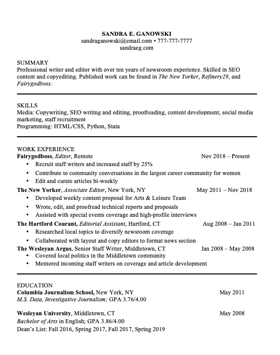
Example.
Tips
- Stay simple. It’s better to have a clean look than have a clumped and messy layout.
- Make it easy to read — by both hiring managers and automatic tracking systems.
- Choose your words carefully.
- Customize your resume for each job you apply for.
- Prioritize your most recent work.
- Be precise, whether it’s the time you worked at the company or how much revenue you brought in.
Here's to composing not only the most qualified resume but also the best-formatted.
Don’t miss out on articles like these. Sign up!
Zoë Kaplan is an English major at Wesleyan University in the class of 2020. She writes about women, theater, sports, and everything in between. Read more of Zoë’s work at www.zoeakaplan.com.


Share your insight
Join an authentic community that helps women support each other at work. Share your professional experience or ask for advice — you can even post anonymously.