Why Making a Personal Website is The No. 1 Thing You Need to Do in 2021 (Plus, 50 Examples)
Time to revitalize your personal brand! The job market has never been more competitive. So, how can you stand out from the crowd and show your capabilities?
One answer is a personal website. No matter what your industry or specialization, this is can be an important self-marketing tool that will all your to exhibit your talents, attract potential clients or employers and market your general brand and professional identity.
Why you need a personal website
Your digital presence matters — the good and the bad. After a tumultuous year, job seekers must find a way to set themselves apart from other applicants. A strong personal website is is a means of showcasing yourself as a professional: the past work you’ve done, your skillset and even your personality. This can take you beyond the traditional cover letter, resume and LinkedIn profile that often constitute today’s applications. With compelling content, copy and visuals, your website will demonstrate an identity that could make a real impact on recruiters and hiring managers.
So, how do you create a personal website that will give you that polished, professional reputation you need? Check out the examples below for ideas, and read our tips for more inspiration.
The 50 Best Personal Websites of 2021
1. Gary Le Mason
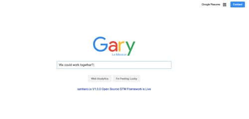
This clever layout mimics many people’s home page — Google. Click on the Web Analytics button, and you’ll find a detailed description of Gary Le Mason’s work and how it can help you with your business needs. Click on the I’m Feeling Lucky button, and you’ll be taken to Le Mason’s contact information and a form to get in touch with the web analytics consultant.
2. Vashti Harrison
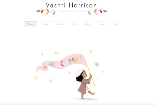
The adorable design is what initially caught my eye about this page. The clear layout and navigation also make this author, illustrator and filmmaker’s personal website both attractive and informative.
3. Nathan Taylor
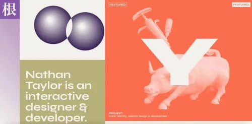
Scroll over each section of the website, and the graphics within it come to life. It’s fun, lively and a little weird — the perfect marketing tool for an interactive designer and developer, Nathan Taylor’s professional identity.
4. Albino Tonnina
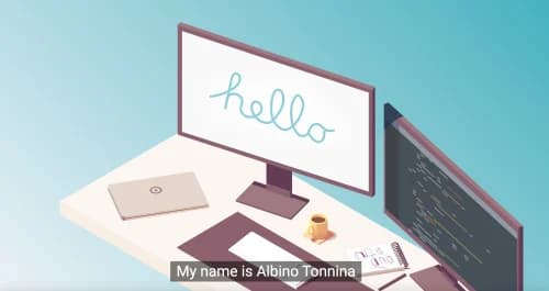
You might be confused at first glance when you view this personal website, but follow the directions to scroll down slowly, and you’ll see the website literally be built before your very eyes. You’ll also learn self-taught web engineer Albino Tonnina’s story and find his contact information.
5. Josh Rubietta
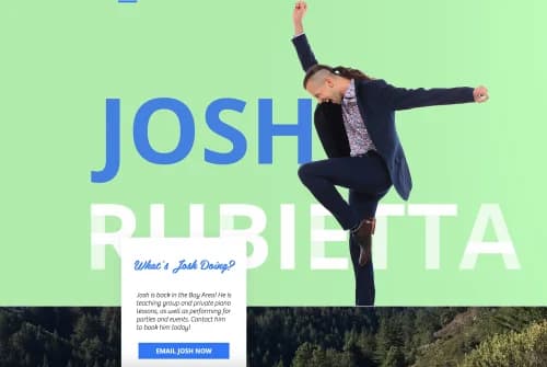
The vibrancy and energy of the personal website scream “Welcome!” Scroll down to see some cool animation, and find out what Josh Rubietta is up to. Each corresponding link directs you to different facets of Josh’s professional work, such as acting, music, dancing and virtual classes.
6. Jingna Zhang
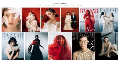
What a better way to introduce fashion and fine art photographer and director Jingna Zhang than with a series of high-fashion covers (including many from Vogue and Harper’s Bazaar) and videos? This aesthetically-appealing layout is ideal for an artist.
7. Dara Hart
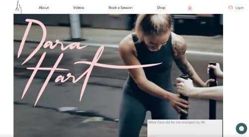
Our first glimpse of Dara Hart is in the kickboxing video she has on the homepage of her website. Immediately thereafter, you’re offered a coupon for a complimentary workout. This is a great way to grab visitors’ attention and draw them in.
8. Ali Wong
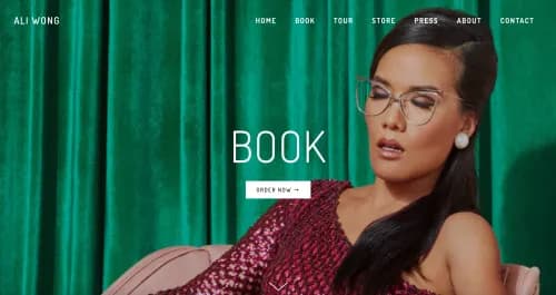
Comedian Ali Wong is a household name, and her website showcases her as the star she is. We love the simple yet vibrant layout of this easy-to-navigate site, with colorful, vertical blocks each representing a different action — order her book, view her tour dates, watch her comedy special and shop for merchandise.
9. Peg Fitzpatrick
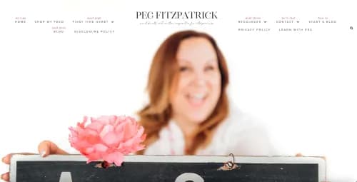
A social media specialist needs to be an excellent marketer, including when it comes to herself. And with this personal website, Peg Fitzpatrick demonstrates that she’s precisely that. She invites you in with a photo of herself holding a #ArtofSocial chalkboard and presents the many different actions visitors can take via the website.
10. JR Taylor
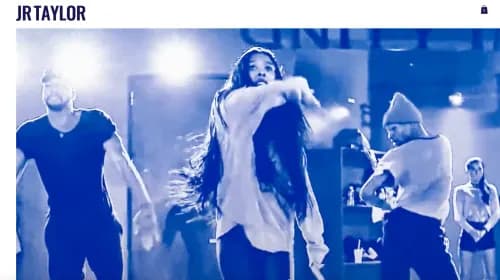
When you head over to JR Taylor’s website, you’re immediately drawn in by an engaging video of his choreography. The legendary choreographer offers additional examples of his work but keeps the layout relatively simple, letting the work speak for itself.
11. Adam Hartwig
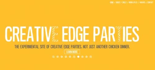
What’s a design technologist? Find out when you visit Adam Hartwig’s fun, interactive website. Roll over the text to change the design, and click on different parts of the site to see some creative animation and view examples of his work.
12. Heather Shaw
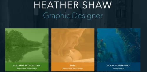
With a relatively straightforward layout and design, Heather Shaw exhibits examples of her work across different niches and media. Shaw also makes her mission and purpose clear with to-the-point, yet still compelling, copy.
13. Rebecca Baker
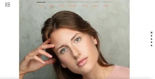
Scroll down the page to see different pictures of actress Rebecca Baker, as well as a demo reel of her acting experience and voice-over work. She also shares her performative, interactive experience in which audience members were meant to follow scattered QR codes to access audio tracks — available on her site, too.
14. Fifty Coffees
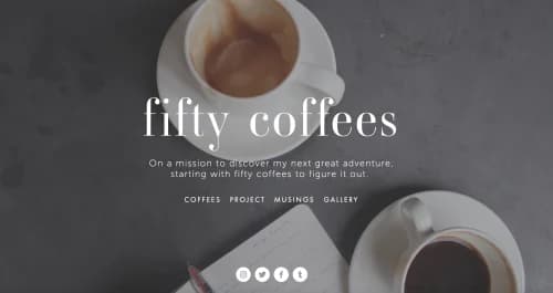
Lindsay, the author of Fifty Coffees, made this website a project in which she would meet with 50 of her friends and mentors to gather advice on preparing for the next chapter of her life. Not only do we think this is an interesting mission, but we also like the clean layout and different media on the site.
15. Adeline Siksik
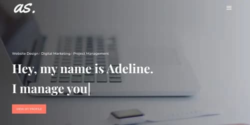
To learn Adeline Siksik’s story, watch the automatic text appear on her homepage. Scroll down to read her clear, to-the-point profile, and find out more about her experience and skills. Siksik also includes samples of her work and quotes from satisfied customers to urge visitors to act.
16. Elizabeth Gilbert
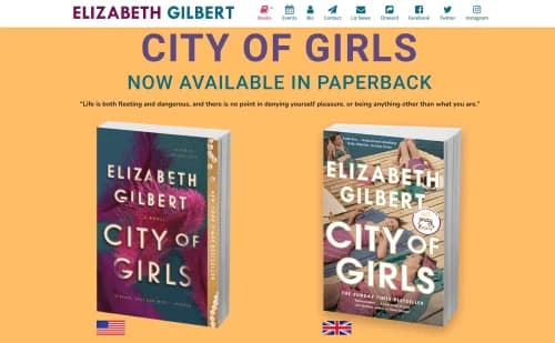
3D bookshots of Elizabeth Gilbert’s latest novel grace the homepage of her personal website. You can also find information about her previous books, events, news and more — along with her bio, book club and social media in a navigable menu at the top of the page.
17. Ellen Skye Riley

Ellen Skye Riley welcomes us to her website with an illustration of the professional, who says she does “a little bit of everything,” laughing. The interactive, animated examples of Riley’s visual storytelling work, which spans presentations, illustrations, branding and motion, add to the overall appeal of the website.
18. Frankie Ratford
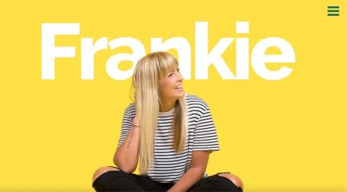
Frankie Ratford’s fun, colorful website shows clear evidence of her talents as a graphic design expert. Scattered among examples of her work and images are testimonials from clients and the services she offers.
19. Jikun Tao
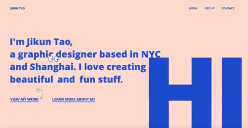
The animation on this website is so much fun! Scroll over Jikun Tao’s name to see a picture of her as a child, and watch “HI” come down from the sky. It’s the perfect testament to the multimedia designer’s work.
20. Oliver Lucien Anderson
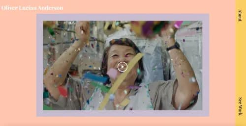
Cinematographer and director Oliver Lucien Anderson keeps his website simple and clean, showcasing several examples of his work across different media through a simple yet effective layout.
21. David Liljewall
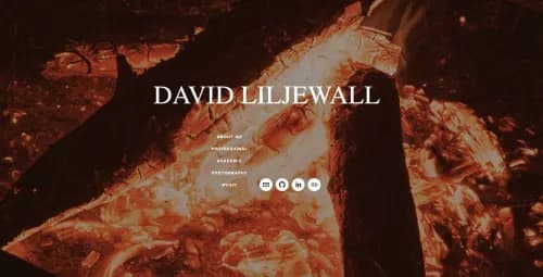
Even though he’s a student, David Liljewall already seems to know the basics of presenting himself professionally. His website background keeps changing to keep you on your toes, and he offers examples of the work he’s already done, including music and photography.
22. Libby Peterson

Libby Peterson really puts the “personal” in personal website. The homepage is a shot of her desk, including symbols of her work and interests: a camera, New Yorker magazines, her laptop, a mug and her adorable cat. Scroll down, and you’ll find a visually-appealing layout of examples of her work in different publications and media.
23. Emily Hogarth
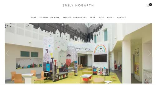
“Making every day magical” is the tagline of Emily Hogarth’s website. The front page has a carousel of images of her papercuts and illustrations, and she offers clear CTAs at the bottom. (Not to mention, I’m a serious fan of her pictures with her dog.)
24. Eileen Grubba
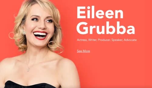
Dynamic text adds some excitement to Eileen Grubba’s website, which showcases her talents as an actress, producer, director, writer and advocate. Grubba uses plenty of images but also makes good use of blank space to avoid cluttering her pages.
25. Samantha Lacey Johnson
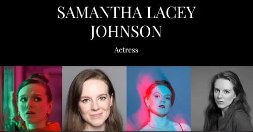
Although Samantha Lacey Johnson’s website is largely static, there are small touches of motion and animation, like when you hover over the actress’s headshots. The website is colorful, but there’s also some solid white space surrounding Johnson’s reel, news updates, contact information and other content.
26. Laura Baross
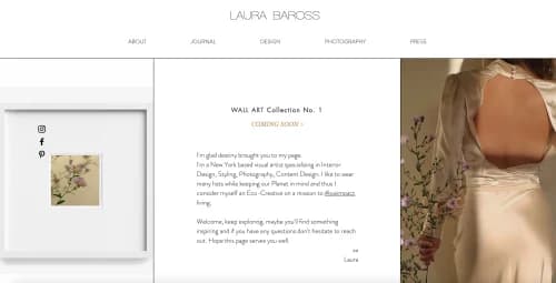
Designer Laura Baross demonstrates her simple, artistic aesthetic with carefully placed images and a clean, effective layout. The website includes a blog, with a tasteful image heading each post.
27. Maegan Guerette
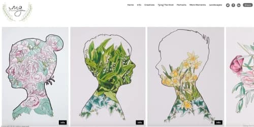
It’s no surprise that photographer Maegan Guerette’s website is artistic. We’re greeted with gorgeous illustrations, each with a button to click that will give you more info about the work. Learn more about the different types of pictures Guerette captures and creates via a menu at the top of the website.
28. Kira Hug

“Own your weird,” Kira Hug’s website declares. The quirky, colorful, engaging site demonstrates the copywriter’s wit and showcases her strong writing abilities. It also has appealing, fun graphics to complement the artful text.
29. Ximena Vengoechea
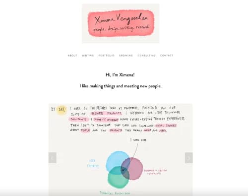
On the front page of Ximena Vengoechea’s website, you can scroll through what appears to be a notebook with a collection of sketches. Dive in to learn more about her work, including books, articles and illustrations.
30. Amanda Rach Lee
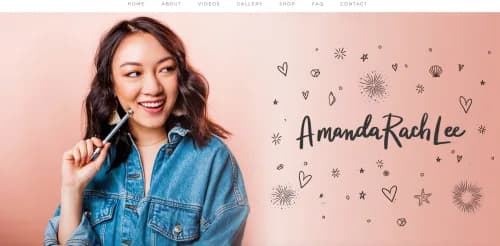
Amanda Rach Lee wants to inspire people with her website, and the multimedia on the site does just that. Watch a video on how to bullet journal, shop for hand-designed stationary or head over to the gallery to see more videos and photos.
31. Tastefully Tash

Tasha Meys uses a variety of media, including photos, videos and podcasts, and soft, pastel color palette to showcase her beautiful portfolios in multiple arenas, including art, food and lifestyle.
32. Matthew Barby
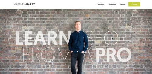
Matthew Barby, an SEO expert, keeps his copy straightforward and to-the-point. “I can help you acquire new customers,” he declares. Barby makes great use of statistics and tips and employs lots of white space, along with visuals.
33. Roxane Gay
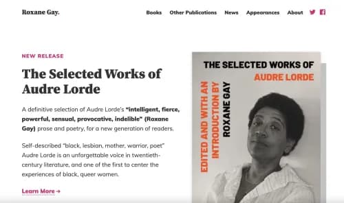
Acclaimed author Roxane Gay’s personal website isn’t flashy, but it does do a great job of presenting her work. Gay’s silly expression in the photo that accompanies her bio shows us that she doesn’t take herself too seriously.
34. Lin-Manuel Miranda

Lin-Manuel Miranda’s website is as charming as the jack of all trades himself. We love the favicon, as well as the careful use of graphics and animation. It’s clear that he’s not giving away his shot...at showcasing his many talents.
35. Jimmy Carr
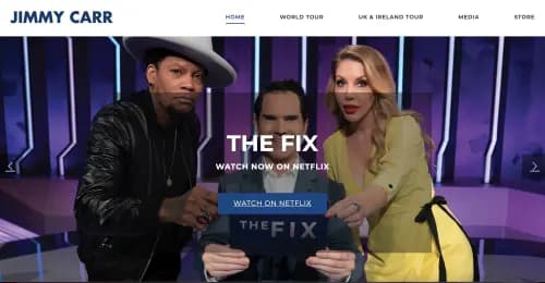
A carousel on the front page of Jimmy Carr’s website shows all important facets of his career: his Netflix specials, his tours and The Little Tiny Quiz of Lockdown, all in front of photos of Carr with quizzical and goofy expressions.
36. Lisa Dawn Bolton
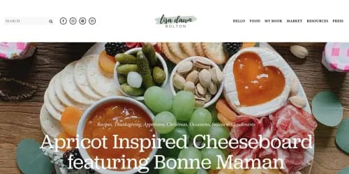
Yum! That was my first reaction to Lisa Dawn Bolton’s website, which features photos of artfully arranged meals. Immediately, a window pops up letting you sign up to never miss a recipe from the food stylist and cookbook author.
37. Johnny & Heidi
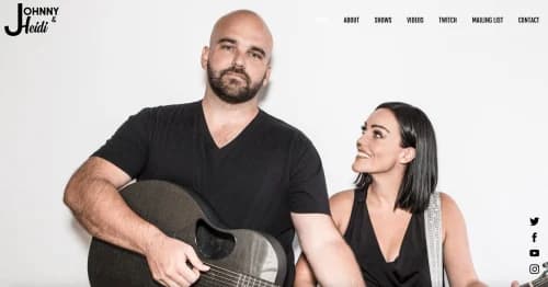
This newlywed singer-songwriter couple makes great use of contrasting light and dark colors on their website, which features a backdrop of a picture of the couple as you scroll through tour dates, videos and more.
38. Ben & Julia Studio
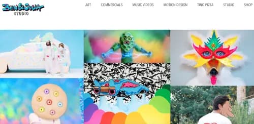
It’s almost a psychedelic experience perusing Ben & Julia Studio’s website, a clear testament to the power of the pair’s work. Click on each photograph and learn all about the background and story behind it.
39. Jeremiah Tall

Jeremiah Tall’s irreverent copy, visuals and overall website covey his brand, “reinforced with the will of the wild and strengthened by the stories of mankind’s struggles with desolation.” He also offers samples of his music and videos and lists his tour dates.
40. The Lifers
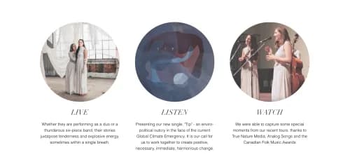
The Lifers, a Canada-based, sister-duo art-folk/rock collective, use light, earth tones to convey a soft image. On the home page, you can play one of their songs through a player at the bottom, without interrupting your perusal of the website.
41. Mary Prankster
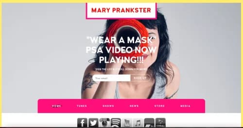
Clearly, Mary Prankster keeps her content timely, with a “Wear a Mask” PSA video at the top of the website. In a simple, colorful layout, she presents videos of her songs, shows and additional work.
42. Annie Atkins
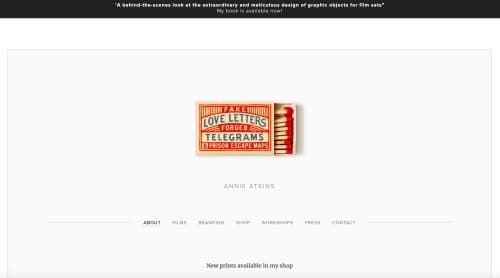
Annie Atkins uses plenty of white space and carefully chosen images to showcase her professional persona and work as a film graphic designer. She also offers stories and insights about her projects, bringing her personality to life.
43. Susan Cain
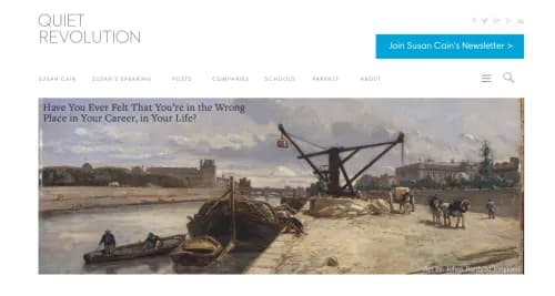
I love the imagery and peaceful video of a man reading that are featured on Susan Cain’s website. Scroll down to learn all about the Quiet Revolution, a community and the subject of two of Cain’s books on this carefully laid-out website.
44. Georgiou Orestis

This researcher, inventor, physicist, technologist and engineer displays his talents with a meticulous, carefully designed website. The use of neutral tones makes the photos and examples of Georgiou Orestis’ work stand out.
45. Moonfruits
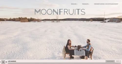
You’re immediately transported to a scenic beach when you enter the Moonfruits’ website — but there’s much more to see (and hear). Check out the duo’s videos, and learn all about their origin story. You can even access a version of the website in French, as well as English.
46. Alex Fletcher
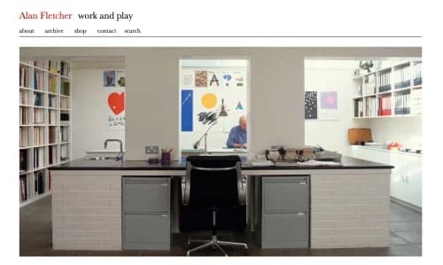
“Work and play” is Alex Fletcher’s stated motto. On the homepage, you’ll get a firsthand look into Fletcher’s work. Dive deeper, and you’ll find samples of his art and exhibitions, as well as his story.
47. Megan Batoon
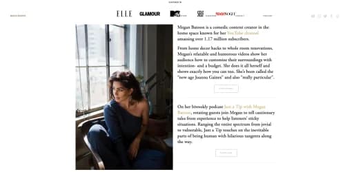
While her website has a sparse feel, it contains everything you need to know about comedic content creator Megan Batoon. Don’t forget to “follow me @meganbatoon on Twitter and Instagram (and drink water).”
48. Andrew Huang
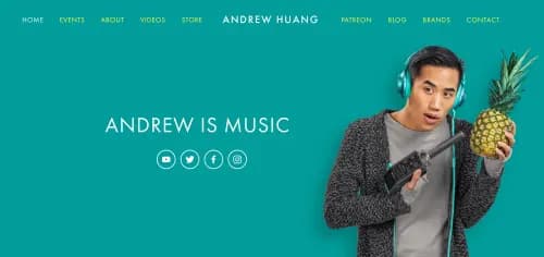
We’re immediately captured by the funny, irreverent vibe of Andrew Huang and his bold, vibrant website. Why is he holding a pineapple? Keep reading and perusing, and you’ll find out everything you need to know about this music and video producer.
49. Hiro Kanagawa
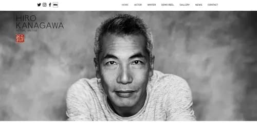
Hiro Kanagawa’s website starts off in grayscale, except for a splash of color in the logo, and steadily morphs into color, piquing our interest and prompting us to learn more about this actor and writer.
50. Felix Kaiser

Felix Kaiser’s entire homepage is a cartoon depiction of the customer experience professional. Kaiser avoids overdoing it and offers the bare essentials: his LinkedIn profile, his publications and his biography.
7 tips for creating a personal website
1. Make your point clear.
What you do and who you are professionally should be obvious from the get-go. On the first page, visitors should know what the purpose of the website is, whether it’s to share samples of your clips, sell particular services or products or gain publicity for your portfolio.
2. Play to your strengths.
If you’re an artist, ensure that you have strong visuals and showcase your work in an attractive, appealing way. If you’re a writer, craft compelling copy in all areas of your personal website. This is an introduction to your skillset, so demonstrate your knowledge and prowess in the space you have.
3. Keep it simple.
Be careful to avoid having too much clutter. Make the navigation and different pages clear. You don’t want to distract from your main pointers and message with an unnecessary jumble of words and pictures; this will turn visitors away.
4. Use visuals — and space.
Whether or not you’re an artist, it’s helpful to incorporate visuals that complement the rest of the website and break up the text. But, again, don’t clutter up the pages — it’s also important to have some blank space to prevent the visuals from overwhelming your visitors. (And make sure you’re legally allowed to use any images you didn’t create yourself or don’t own. Don’t forget to credit sources!)
5. Add compelling content.
Consider what your target audience wants. Perhaps you want to engage readers with blog posts related to your interests, talents or industry, or maybe you want to give them a taste of your services with video demonstrations. Or, you might share an interview with an industry leader. Add content that will appeal to your target visitors.
6. Make it unique.
With so many personal websites across industries out there, you’ll need to find a way to stand out from the crowd. Think about what you bring to the table that sets you apart from others in your field, and find a way to showcase that on your website.
7. Optimize it.
In order to make sure people can find your website, you’ll need to optimize it for SEO. This can be difficult if you’re not an expert since the craft is ever-changing, so, if you have the budget for it, you might want to hire a professional SEO specialist or consultant to help or run it by a friend who’s well-versed in SEO best practices.
Other resources
For more guidance on how to build your own personal website, check out these resources:
• How to Build a Personal Website: A Step-by-Step Guide, Wix Blog
• The Ultimate Guide To Building A Personal Website, College Info Geek
• How To Start A Personal Website Or Blog, The College Investor
Is there a personal website you love? Have any tips, or questions about creating your own? Sound off in the comments!
Why women love us:
- Daily articles on career topics
- Jobs at companies dedicated to hiring more women
- Advice and support from an authentic community
- Events that help you level up in your career
- Free membership, always
